
In technical analysis, a chart pattern is a formation on a stock chart that clues you in on highly probable future price movements. Chart patterns are therefore commonly used to trigger buy and sell signals, but can also be employed to identify trends and reversals without immediately acting on the info.
A general assumption within the field of technical analysis is that history repeats itself. If we prescribe to this notion, we can also believe that if certain patterns have preceded certain movements in the past, they are likely to do so again. If we learn which patterns that are associated with which future movements, it can help us become more successful traders.
Two crucial aspects of technical analysis are trend continuation and trend reversal. As traders, we naturally want to know if the trend we are observing is about to continue or if we will see a reversal soon. This is why so many of the well-known chart patterns are either continuation patterns or reversal patterns. A continuation pattern signals that the trend will continue once the pattern has been completed. A reversal pattern signals that the trend will reverse when the pattern has been completed.
It is important to remember that a single chart pattern only tells part of the story. A skilled technical analyst will typical seek out additional information to see if that information collaborates what the chart pattern is saying.
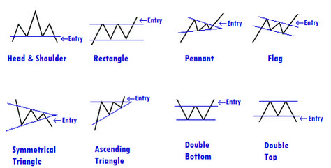
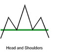
Head & Shoulders
 For many analysts, this was the first chart pattern they learned as they ventured into the world of technical analysis.
A head & shoulders pattern consists of the left shoulder, the head and the right shoulder. If you draw a horizontal line that runs through each low-point you get the “neckline”.
Head & Shoulders signals a trend reversal.
Example
Right now, the trend is an upwards trend. Suddenly, you spot a shoulder pattern. The left shoulder is made up by a high peak followed by a low. From the low point, the pattern continues up to a higher high and then down to the same level of low as before. This is the head. The head is followed by a new high that is of roughly the same height as the first high (lower than the second high) and then a low that reaches down to at least the same low level as the previous two lows. This is the right shoulder. The neckline, running through the low-points, is the support.
An upward trend is a period denoted by rising highs and rising lows. When the H&S pattern appears, something has changed. The lows are not getting any higher, and although the head is higher than the left shoulder, the right shoulder is lower than the head.
Normal H&S and inverse H&S
There are two main types of the head & shoulders pattern. Both types are reversal patterns and you can expect to see a trend reversal once the pattern is completed. The first one is formed at the high of an upward movement, and signals that the upward trend will end once the pattern has been completed. The other one is known as the inverse head and shoulders (or head and shoulders bottom) and signals a reversal of a downtrend.
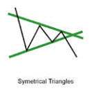
Triangles
 There are three different types of triangles that we suggest novice technical analysts should familiarize themselves with.
- The symmetrical triangle
- The ascending triangle
- The descending triangle
A symmetrical triangle is formed when two trendlines converge toward each other. The symmetrical triangle generally shows a sideways movement. A breakout to the upside or downside is a confirmation of a trend in that direction.
An ascending triangle is formed when the upper trendline is flat and the lower trendline slopes upwards. This is regarded as a bullish pattern and you should be on the look out for a breakout to the upside.
A descending triangle is formed when the upper trendline is descending and the lower trendline is flat. This is regarded as a bearish pattern and you should be on the look out for a breakout to the downside.
Wedge
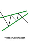 A wedge is slanting upwards or downwards. It tends to form over longer periods than triangles, typically 3-6 months. A wedge can be either a continuation pattern or a reversal pattern, and reading wedges can be difficult – especially for a novice technical analyst. It is considered an art rather than a science. When you start out, you can use this rule of thumb as a guideline: A falling wedge is bullish and a rising wedge is bearish. You are however likely to sooner or later encounter situations where this basic guideline falls short. When it comes to wedges, it is even more important than normally to obtain additional information before any trading decision is made.
Cup & Handle
This pattern looks like a U-formed cup followed by a sloping handle to the right. The handle is formed by a downward/sideways price movement.
The cup and handle pattern is typically formed over at least several months; sometimes over more than 12 months.
C&H is a bullish continuation pattern, where the upward trend has paused by will eventually continue upwards once the cup & handle pattern has been completed. The price will eventually push above the resistance lines formed in the handle, and then the upward trend will continue.
Rounding bottom / Saucer bottom
The rounding bottom, also known as the saucer bottom, looks like a cup only – there is no handle. This is a long-term reversal pattern that signals a shift from downward trend to upward trend. Generally speaking, it will take at least several months to form, and there are plenty of examples of saucer bottom patterns that formed over a period of several years. If you only look at shorter-term trading charts, you risk missing important longer-term patterns such as the rounding bottom.
Double Top & Double Bottom
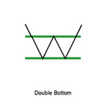 Double Top & Double Bottom are two different patterns, but they are both trend reversal indicators that forms when the price movement tests support levels (double bottom pattern) or resistance levels (double top pattern) twice without breaking through.
The double top and the double bottom are considered reliable indicators of intermediate and long-term trend reversals. After two failed attempts at breaking through the support or breaking through the resistance, the price is likely to succeed on its third attempt.
If we see a double bottom, we see how the price has tried to sink below the support level twice and failed. On its third attempt, it is likely to succeed and we will see a shift into a downward trend.
If we see a double top, we see how the price has tried to rise above the resistance level twice and failed. On its third attempt, it is likely to succeed and we will see a shift into an upward trend.
Flag
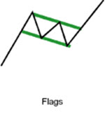 The flag is a short-term continuation pattern. It is formed by a sharp price movement, followed by a generally sideways price movement, followed by another sharp price movement in the same direction as the move that launched the trend. Flag patterns typically last between one week and three weeks.
The middle section of the flag pattern is formed by a channel pattern; there is no convergence between the trendlines.
When you have spotted a flag pattern, you can expect the trend to continue once the price moves above the upper trendline.
Pennant
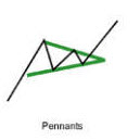 Just like its cousin the flag, the pennant is a short-term continuation pattern formed by a sharp price movement, followed by a generally sideways price movement, followed by another sharp price movement in the same direction as the move that launched the trend. Pennant patterns typically last between one week and three weeks, and you can expect the trend to continue once the price moves above the upper trendline.
So, how is the pennant different from the flag? If we look at the middle section of the chart pattern, we can see that the pennant has converging trendlines – it looks similar to the symmetrical triangle pattern. The middle section of a flag is characterized by a channel pattern with no converging trendlines.
Gap
In a chart, a gap is an empty space that forms between a trading period and the following trading period. Gaps appear when there is a big price difference between one trading period and the following trading period.
Example: During the first trading period, the trading range was $200 – $300. The following trading period opens at $400. Therefore, there will be a noticeable gap on the chart between the first period and the second period if we look at a bar chart or a candlestick chart. On a basic line chart, the gap will not be visible. That is also true for point and figure charts.
If you notice a gap on a chart, take heed. It indicates that something significant has happened, either concerning the traded object itself or to something that has a broader impact on markets.
Depending on where the traded object is in its price trend, a gap can be a breakaway gap, a runaway gap or an exhaustion gap. A breakaway gap forms at the start of a trend, an exhaustion gap forms near the end of a trend, and a runaway gap can form anywhere during the trend except the beginning and near the end.
This article was last updated on: February 28, 2017