A vast number of charts and chart variations are utilized by advanced technical analysts. In this article, we will take a look at four of the most well-known ones:
- The Line Chart
- The Bar Chart
- The Candlestick Chart
- The Point & Figure Chart
Line chart
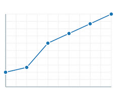 Even if you have never ever come into contact with technical analysis or even stock trading before, you are probably familiar with the line chart, also known as the line graph. This is an extremely common chart that is used to display everything from last year’s summer temperatures to how your baby is putting on weight.
A line chart displays data as a series of data points connected by straight line segments going from one point to the other. Typically, the measurement points will be ordered by their x-axis value (e.g. going from trading day 1 to trading day 5) and the y-axis will display the value of each data point.
A line chart that is used to visualize a trend in data over intervals of time is known as a run chart. Run charts are extremely commonplace in the field of technical analysis.
One example of a run chart that is very important for technical analysts trading in stocks is the one that displays closing prices over a set period of time. You form the line by connecting the closing prices, making it easier to notice interesting patterns and movements. Such a line chart will not contain any information about opening price, high price, low price, volume, etc. It is therefore typically used in conjunction with other charts displaying complementing data.
Bar chart
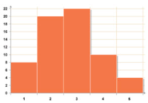 A bar chart, also known as bar graph, utilizes rectangular bars to display data. Typically, the length of each bar is proportional to the value it represent.
A bar chart can be plotted vertically or horizontally. When it is plotted vertically, it is sometimes referred to as a line graph.
Bar charts come in handy when you wish to show comparisons among categories, since each category can be represented with its own bar. The bars can then be lined up along the x-axis (showing the categories) and the y-axis will represent a discrete value.
Some bar graphs present bars clustered in groups of more than one.
As you dive into the world of technical analysis, you can expect to encounter a very popular bar chart that displays information about:
- The high price and the low price for the trading period, represented by vertical lines.
- The opening price and the closing price, represented on vertical lines by a horizontal dash. The dash on the left side of the vertical bar is the opening price. The dash on the right side of the vertical bar is the closing price.
If the left dash is lower than the right dash, the bar is typically coloured black – notifying the analyst of an up period for the stock. If the left dash is higher than the right dash, the bar is typically coloured red to signify a downward price trajectory for the share.
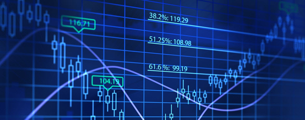
Candlestick chart
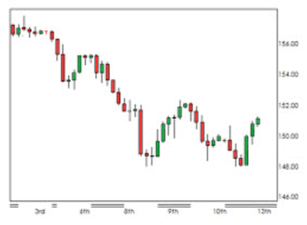 A candlestick chart, also known as a Japanese candlestick chart, can be described as a combination of a line-chart and a bar-chart. In technical analysis, the candlestick chart is commonly used to display price movements, where each “candlestick” represents one day. Each bar represents opening price, closing price, high price and low price. A thin vertical line displays the trading range for the period, while a wide bar on the vertical line represents the difference between opening price and closing price. This makes the candlestick chart densely packed with data. In general, technical analysts will use candlestick charts to look at price movements for fairly short periods of time, e.g. a few trading sessions.
When if comes to colouration, different software uses different colours sets, so it is important to know which ones that are used by this specific software or chart provider when you look at candlestick charts. Many (but not all) will let the candlestick be white or clear for trading sessions where the price closed above the opening price. Conversely, a trading session where the price closed below the opening price is typically marked with the colour red or black.
In a situation where the close price was below the opening price, but still above the close price of the previous session, the candlestick can be black, white or clear – which can be confusing at first.
Point & Figure chart
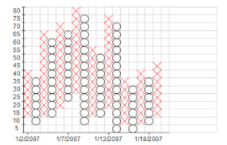 The point and figure (P&F) chart is not used to display chronological changes over time. In technical analysis, the P&F chart plots price against changes in direction. A very common P&F chart is the one that plots price against changes in direction by plotting a column of X:s as the price rises and a column of O:s as the price falls.
The chart described above is helpful in situations where you need to clearly see price movements, without being distracted by time and volume. It is a great tool for getting rid of insignificant price movements and filter out clutter. The P&F technique might seem like a novel thing, but it is actually well over a century old. It is for instance mentioned in Hoyle’s book “The Game in Wall Street” which was published back in 1898.
Example
We are looking at a stock price chart that consists of a series of the letters X and O. All the X:s represents upward price trends and all the O:s represent downward price trends. There are also numbers present, as well as other letters. They represent months and also give you an idea about the date.
Each box on the chart signifies the price scale. The price scale adjusts depending on the stock price; the higher the stock price the more each box represents. In this case, one box signifies $1 (or 1 point) when the stock price is within the $20 – $100 interval.
Knowing the reversal criteria for the chart is important. In this case, it has been set at three. This means that the price must move away three steps from the high or low in the price trend to create a new trend. Thus, a price movement of three steps is required for an X to turn into an O.
Each time the price trend has moved from one trend to another trend, it shifts to the right. This makes it easy to notice trend changes.
This article was last updated on: February 28, 2017